Unifying a healthcare product family
The problem
Mylab's product family had grown one product at a time. Each application had its own visuals, terminology and behaviour: legacy interfaces sat next to modern web apps. Laboratory professionals often move between several of these applications in a single workflow. Every inconsistency adds cognitive load, and in healthcare that means a higher risk of human error. The fragmented look also weakened the first impression in sales demos.
The real constraint
The 18 applications ran on at least three front-end technologies, from older legacy frameworks to modern web technology, and use of the shared design system varied between interfaces. Even a purely visual change had to be implemented separately, and often custom-built, in each interface.
My role
I initiated the unification and owned its strategy, roadmap and business case. I led the UX team that delivered it and designed key concepts hands-on.
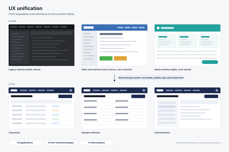
Approach: what I did differently this time
I had led a similar unification at F-Secure/WithSecure, and this time I changed my approach:
- Business case first. I framed unification in business terms: sales impact, customer satisfaction and the risk of human error. That got it prioritised against feature work.
- A pragmatic design system. We created a design system on the component framework the development teams already used, so adopting it required no new technology decisions.
- Phased, shippable steps planned. Visual basics came first, then shared components, and finally functional unification: one login, switching between applications, and switching roles without logging out.
- Quality built into the process. I introduced a shared UX definition of done for all development teams, user journeys at the definition stage, and quick usability testing.
- Terminology and communication. Terminology was treated as part of the user experience, and visible changes were introduced to customers with a planned communication.
A fixed launch date and my scope decision
The first phase of unification was a business priority, and the company wanted it visible in the spring 2025 product launch. That fixed the timeline. I decided to start with the visual layer: brand colours, typography and the logo. It was the change customers would notice, and the only one we could realistically deliver across all three technologies by the date. Functional unification was moved to later phases.
The tight timeline meant some follow-up fixes in the oldest interfaces. I made them an explicit first step of the next phase rather than leaving them in the general backlog.
A deliberate trade-off
The newer applications already used a light visual style. Together with brand and product management, we decided to bring the legacy interfaces in line with it rather than keep two visual languages. We knew some long-time user groups, used to the older dark interface, would not like the change. We accepted that consciously, prepared customer communication in advance, and planned a user-selectable dark mode as the follow-up.
Outcome
- Visual unification shipped across the entire product family of 18 applications.
- At an industry event, early feedback on the new look was positive, and in a side-by-side comparison our interface came out ahead of a competing system.
- In the product NPS survey, everyday users described the product as clear, easy to use and logical.
- The survey also confirmed what we had anticipated: expert users missed the dark theme and asked for stronger visual distinction. The same survey validated the next phase, because users asked to switch roles and applications without logging out. That was exactly what our research on a unified login addressed.
What I learned
- Shipping a unified portfolio was worth more than waiting for a perfect one. I chose to deliver visible unification across all 18 applications within the launch window instead of holding out for full functional unification. For the first time the product family looked and felt like one product to customers, and it gave every later phase a common foundation.
- I owned the trade-offs and planned how to close the gaps. I made the call knowing that some expert users would miss the old dark interface and its colour cues. The feedback confirmed this, and a user-selectable theme and clearer functional colour coding are already part of the roadmap. Next time I would ship the theme option together with the change.
- Design leadership includes securing delivery. A unified experience lasts only as long as someone maintains it. I now plan development capacity and clear ownership of the design system as part of the programme from the start, not as a follow-up.
Create Your Own Website With Webador